Showing posts with label Portland Stage Company. Show all posts

Friday, February 8, 2013

love letters

'Tis the season: love's gonna get me through the blizzard outside. I've got my valentine making station all ready.

If the power goes out, I still have hands, glue sticks, scissors and paper. I've been thinking about the power of old fashioned love letters lately. Who still sends them?

What a joyful greeting this door made when I visited my dear friend Mary Anne Lloyd!


We share a love of snail mail and fond attention to hand lettering, groovy stamps, and stickers. Oh, and illustrative tape, too! Here's a recent batch of my mail on it's way.


My love of letters could be one reason I seized on the chance to illustrate the poster for Portland Stage Company's upcoming production of A Song at Twilight by Noel Coward. The play turns on a batch of old love letters, with considerable drama.

These are a couple of sketches I liked that didn't get picked:


This sketch got the nod for further development:


It so happens I came across a batch of old letters in my parents' basement that became a reference point in my illustration.


And here's a little known fact: my almost 25 year marriage was born in a long-distance exchange of love letters. Got 'em stashed somewhere...

So then I sent this color sketch:


Marketing director Carole Harris was not keen on the red here, so I ditched that in my final, and she was, as always, right on the mark.


Meanwhile, valentines must be crafted. I've got all the fixin's...


I invited my fellow paper vixens over to make a fine mess.


Eda French, Nancy Gibson Nash, Mary Anne Lloyd, and Daisy Braun made the day so sweet!


Here's a few of our confections:


What's not to love about pink paper and polka dots? Happy Valentine's Day, everyone! Check here in the next couple of days for some downloadable valentines.


Wednesday, October 10, 2012

october fest

October is my birth month, so the opal in my soul shines a little brighter these days. I received a fantastic surprise via Caroline Arnold, author of A Warmer World: my first book trailer!


One luxury is being between deadlines, and having time to enjoy the busy scene in Portland.
Marty and I attended the preview opening for Elegant Enigmas: The Art of Edward Gorey at the Portland Public Library.


Kudos to Scott Nash, who found the sponsors to bring this incredible show to town. Here he recites a few of his favorite Gorey rhymes.


It was a delighted crowd, and one filled with familiar faces, including former students and MECA folks.


I brought my current MECA class a few days later, who marveled at Gorey's fine line work, his meticulous craft of hatching limitless shades of tonality, and absurd characters in morbid settings.
The exhibit includes sketchbooks, unfinished and unpublished drawings, decorated letters, miniature books, handmade character toys, and a bounty of illustrations from Gorey's eccentric oeuvre. SEE IT.


The cool thing is the Gorey Shop, where I bought myself his paper theater of Dracula!


It made me wonder if Anita Stewart, artistic director at Portland Stage, has this much fun creating sets.

We saw The Sisters Rosensweig at last! As always, the set is divine. Makes you want to move on stage with all of them.


I laughed at the life imitates art poster in the lobby:


I read the script months ago, well before casting. Each actor completely inhabits their character, especially Carole Healey, who plays Gorgeous with total guts. Loved her! The production is fantastic. A complex story with dips of drama and hilarious comedy, it's flawlessly paced by the large cast.

All these invented worlds give me goosebumps. And inspiration. Now to tackle my personal projects, waiting so patiently for that "between deadline" time...

Friday, September 21, 2012

Sisters!

Final details are working into place for the opening of The Sisters Rosensweig at Portland Stage Company. I dropped off the original art as well as process sketches yesterday.


Indispensable Intern and Marketing Journeyman Todd Backus helped me hang the works in the lobby. Portland Stage likes to showcase all aspects of what makes a production, including the marketing visuals. Lucky me!

I enjoy seeing my illustration in it's various incarnations. This large horizontal hangs in the lobby.


There's a sign on the sidewalk on Forest Avenue.


And a narrow poster on each side of the theater entrance.


Todd snuck me into a rehearsal to see the stage set. Brilliant, as always.

Now I should call MY sister. We don't see each other enough! You can see the resemblance though, in this old photo I just found of Bonnie and me.


We're as different as the Rosensweigs, but that sistah blood runs mighty deep.

Thanks to Portland Stage for the opportunity to illustrate this one, pulling elements together to suggest the love that binds three very different sisters, for whom aging brings a complex weave of wisdom and reckoning.


Tuesday, August 28, 2012

poster process

I just spotted my marketing visual for Portland Stage Company in print, so now I can spill about what fun I had illustrating it.


By Wendy Wasserstein, The Sisters Rosensweig, is an award-winning play, a funny family drama about three Jewish-American sisters who gather in London for the birthday of the eldest. There's great dialogue, dishing, and reckoning about love and choices each have made. After reading the script, I made about 14 rough thumbnail sketches to show Carole Harris, marketing director extraordinaire. These are loose and quick, and 3 that led to the final image:


The one above got the green light, to refine in that direction. From here, I needed models. I called three of my neighbors who fit the age categories and asked them to mimic my sketch, sort of.


Thanks to Christine, Kathryn, and Maria Grace! Now I need to gather them again, this time WITH actual wine and cake. You can see I worked from both photos, plus one of mine from our trip to London in April.


Before any drawing, I created a color pastel environment, to set the mood more than for realism. I wanted the warm colors to wrap around the sisters, a metaphor for what binds them.


I make my final drawing on tracing paper, then retrace it on the reverse side in charcoal. Then I rub the line drawing (with red color pencil) so a shadow is left on the pastel paper. Old-fashioned carbon paper, yes.


By the time I draw the final illustration, I know it pretty well, having drawn it multiple times, each time a little different.


Here is the final drawing, with my reference for Big Ben on the side.


I leave lots of room for "bleed" or extra area that allows for various crops, to fit the wide variety of marketing formats used by Portland Stage.

The script calls for a list of props, among them a chintz sofa. I wanted to add a chintz pattern to the illustration. Peonies were in bloom back when I worked on this. They drove me to considerable distraction.


Here's the drawing that became my pattern.


At this point, my better half, Marty, showed me the technique for doing this in Photoshop. Always nice to learn new digital tricks.


And voila, final illustration. I added the hand-lettering of the title, playwright, and dates on another layer in Photoshop, sending it all to the designer, Secret Weapon Karen Lybrand, to use in countless ways.

I am eager to see the production, as Portland Stage never disappoints!

Wednesday, May 16, 2012

the play's the thing


Theater is on the brain here. Marty and I had the good fortune to attend Portland Stage's annual Spring Gala benefit last week. I illustrated the brochure (above) and then created a layered collage in a shadow box, below.


This was presented to L.L. Bean at the event, in honor of their loyal sponsorship of Portland Stage.
 Here's Artistic Director, Anita Stewart, with the art:


Her dashing husband, Ron Botting, then handed it to Rosemary Moser, Community Relations Director at LL Bean.


Elements from my illustration were used in signage here and there, in curious company at the Masonic Temple in Portland, Maine.


Signed posters were auctioned off. Here I am mingling with mine, for the current show, Marie Antoinette: The Color of Flesh.

Marty's admiring his, for The God of Carnage, and Santaland Diaries.


I was also pleased to see Jacques go to a good home, the endearing dog sculpture carved by MECA grad, Thomas Dowling. Jacques made an indelible appearance in Heroes recently and was an instant hit. Portland Stage auctioned him off in style.


I'm thrilled to have my work on display in the theater lobby during the run of Marie Antoinette. The show is a spectacular production, with lavish costumes, a sizzling love triangle, and flawless set designs. I'm going again, for the final show on Sunday, with a sketchbook in hand this time.
So much to take in!

Next up will be 2 Pianos 4 Hands, back by popular demand. And it's my poster!


Tonight Marty's heading over to the Little Festival of the Unexpected, to see Love Sick by John Cariani. Marty just might do the poster for the next season's production.

Meanwhile, I'll stay home by the drawing board, working on sketches for The Sisters Rosensweig, due next fall during the 2012-2013 season.

The play's the thing!


Tuesday, March 6, 2012

paper theater

It's been my good fortune to work with Portland Stage Company, a highly original and energetic group of amazing creators. Here's the process for my latest poster for the production Marie Antoinette: The Color of Flesh, which I began last summer. For efficiency, the entire season's marketing needed to go to the printer well in advance. The play opens on May Day.

Of all the offerings, I seized on this one. Fashion, history, flesh...what's not to love? I dove in by reading a couple of books, watching a couple of movies, and reveling in the realms of Versailles.

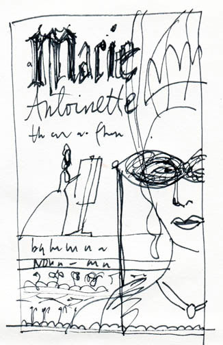
I did a record number of sketches, 14 in all! Here are the ones they liked in general. The play involves a female court painter, Marie the queen, and a dashing count, making for a delicious triangle of intrigue.


I was playing around with those three figures in a variety of compositions and incorporating the title in a decorative way. The gowns are so elaborate it seemed like a good foil for text.


They liked the palette in this, and the easel. Part of the action takes place in a studio setting.


In this one, I again use the costume for the title.


I heard the designer, Karen Lybrand, liked this one, showing the painting in progress.


This was one of my favorites. Couldn't resist the cake metaphor paired with a strong silhouette that serves two visual purposes.


But, never say die. It was my last sketch, the 14th one, that made the pick.


At this point, I went back to the book I had read for more inspiration. Antonia Fraser's biography is downright fascinating and exquisitely thorough.


I presented this sketch before getting approval to begin final art.


And voila! My finished pastel.


Here's the poster.


More recently, I was approached by the client to produce a visual for an upcoming benefit, their annual Spring Gala. Yes! I immediately loved the idea of a pair of characters going to the proverbial ball. I matched two favorite characters, Ba, from Portland Stage's production of the Snow Queen and Marie Antoinette. As a nod to their loyal supporter, L.L.Bean's 100th anniversary, I created a magical outdoor setting, complete with canoe.

Here are a few of the rough sketches presented:


They liked the bottom middle above, so I did a larger, more detailed sketch for approval.


One major perk of working with Portland Stage is complimentary tickets! And it's not just taking in the performance that is the prize. I love seeing their process as well. I'm besotted with the little paper theater sets that Anita Stewart creates. This one was for Last Gas.


Her background in architecture comes in handy, no doubt. But all of it brings back playing with dolls, creating miniature worlds, and falling into imaginary stories. For the final art for the gala piece, I wanted to create something a bit more dimensional. A paper collage set, sort of.

Because the marketing materials have so many applications of different sizes, it helps to provide the illustration in pieces. I did this little spot super fast for a save-the-date mailing.

I scanned each element separately so the designer could use bits for various needs. Here's the final flyer. Found some actual birch bark to collage onto the canoe.


Several whale illustrations later, I returned to the gala project. I was a little less sure by then how I would get the whole thing to work. Not a lot of time left. Here's the pieces lying on the table.


I decided it needed a bit more collage, and then I called in my better half, Marty, who pulled it all together seamlessly.


I guess now it's time to look for a gown! We already have a pair of antlers.

Meanwhile, I am proudest of the company I keep. It's fun to be hanging next to esteemed illustrators such as Doug Smith (who created posters this season for Trouble Is My Business and Heroes) and Daniel Minter, who illustrated the posters for The Morini Strad and Hidden Tennessee. Here we are in the lobby at Portland Stage Company.


I'm excited to see Hidden Tennessee this weekend. I'll be applauding from the audience in more ways than one. Thank you, Portland Stage!